

Oracle Structures
Building some of Australia’s most significant concrete structures requires more than technical expertise—it demands confidence, precision and trust. This brand evolution positions Oracle Structures as an industry leader through a refined visual identity that reflects the quality and scale of its work.
Branding.
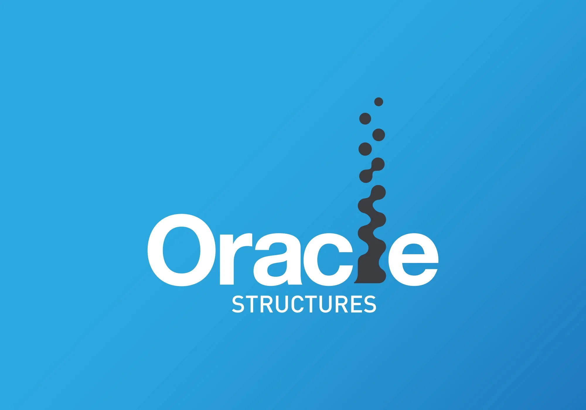
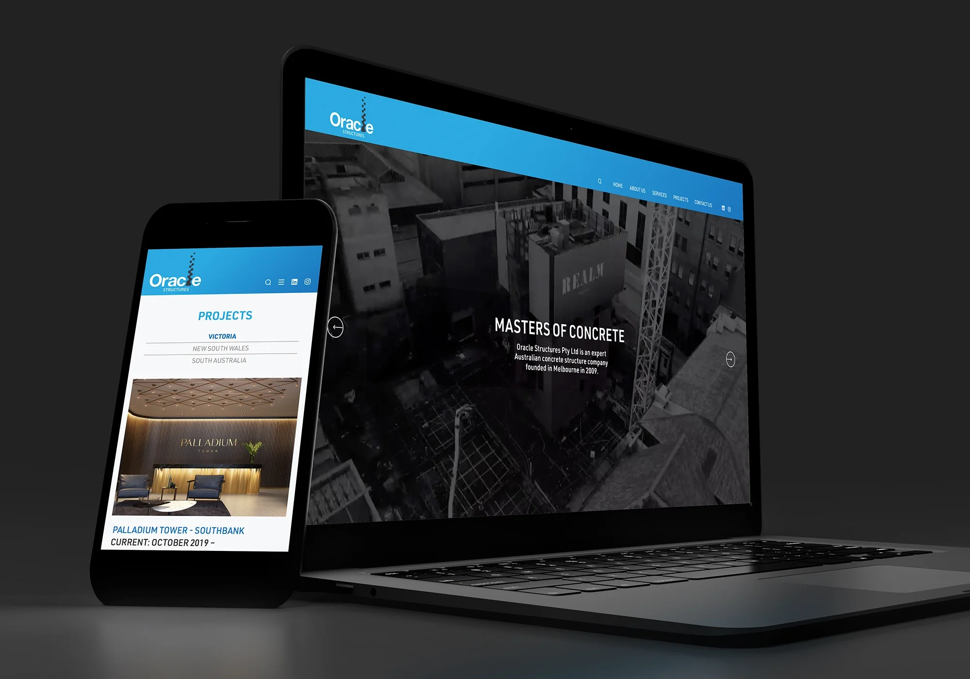
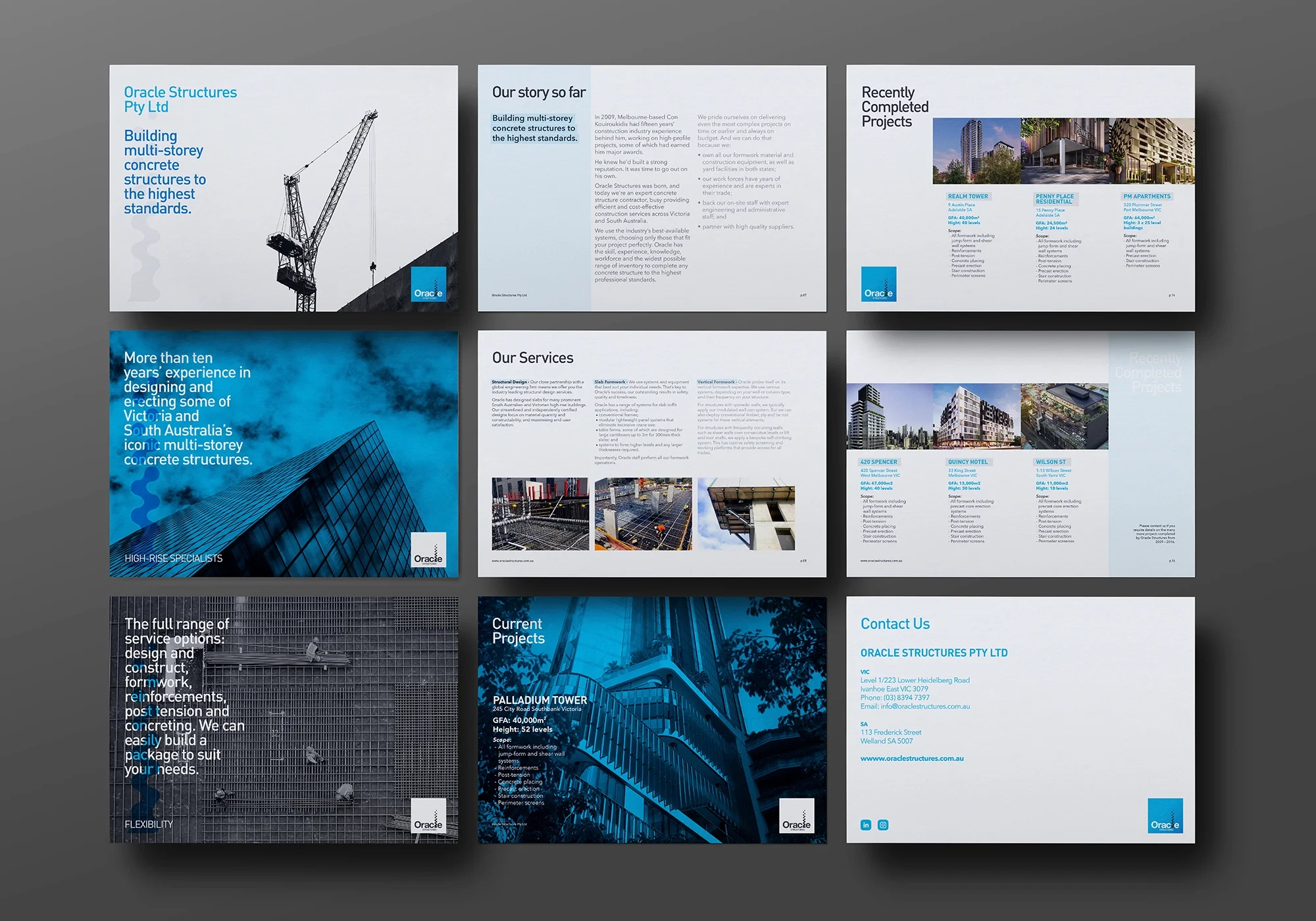
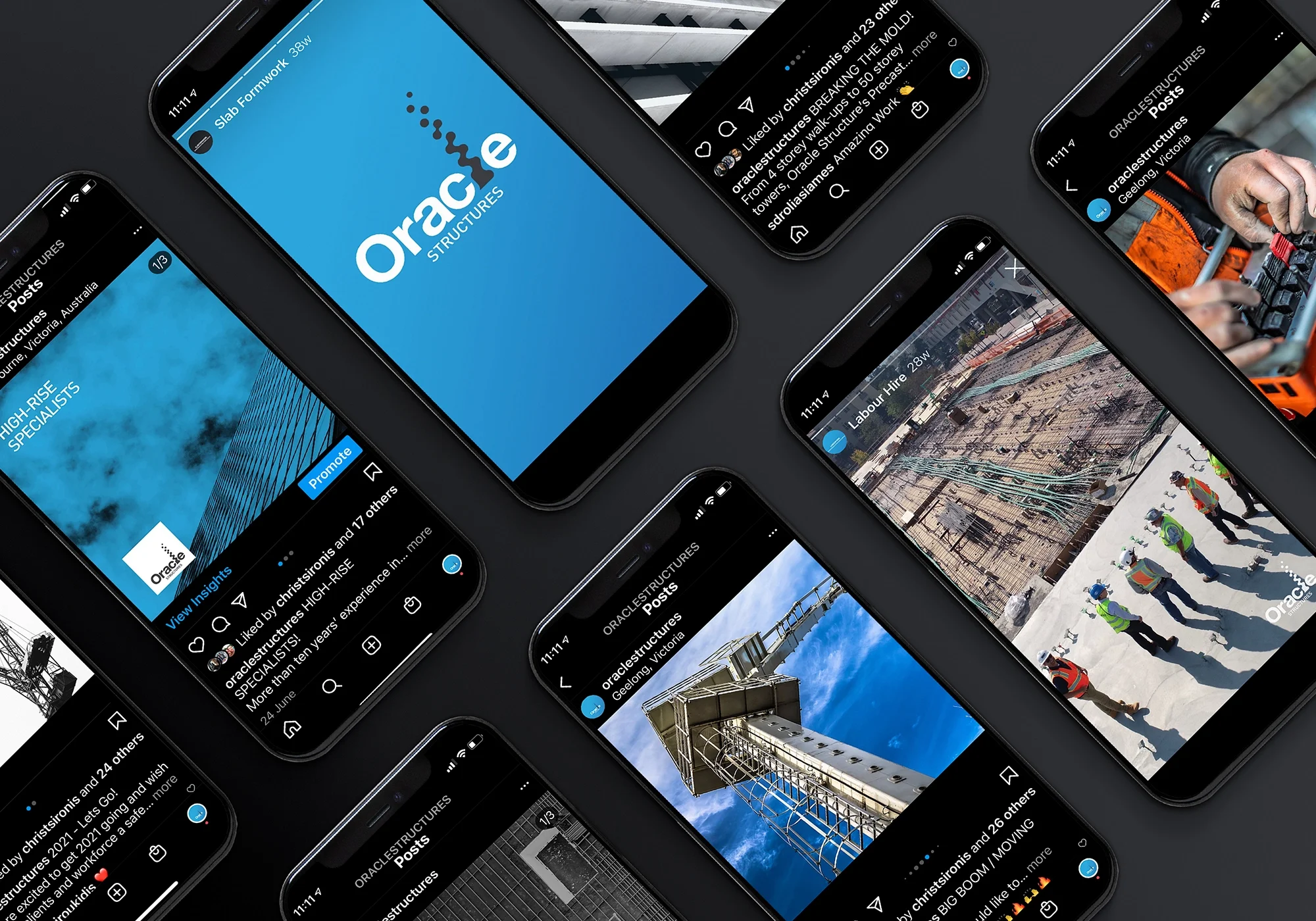
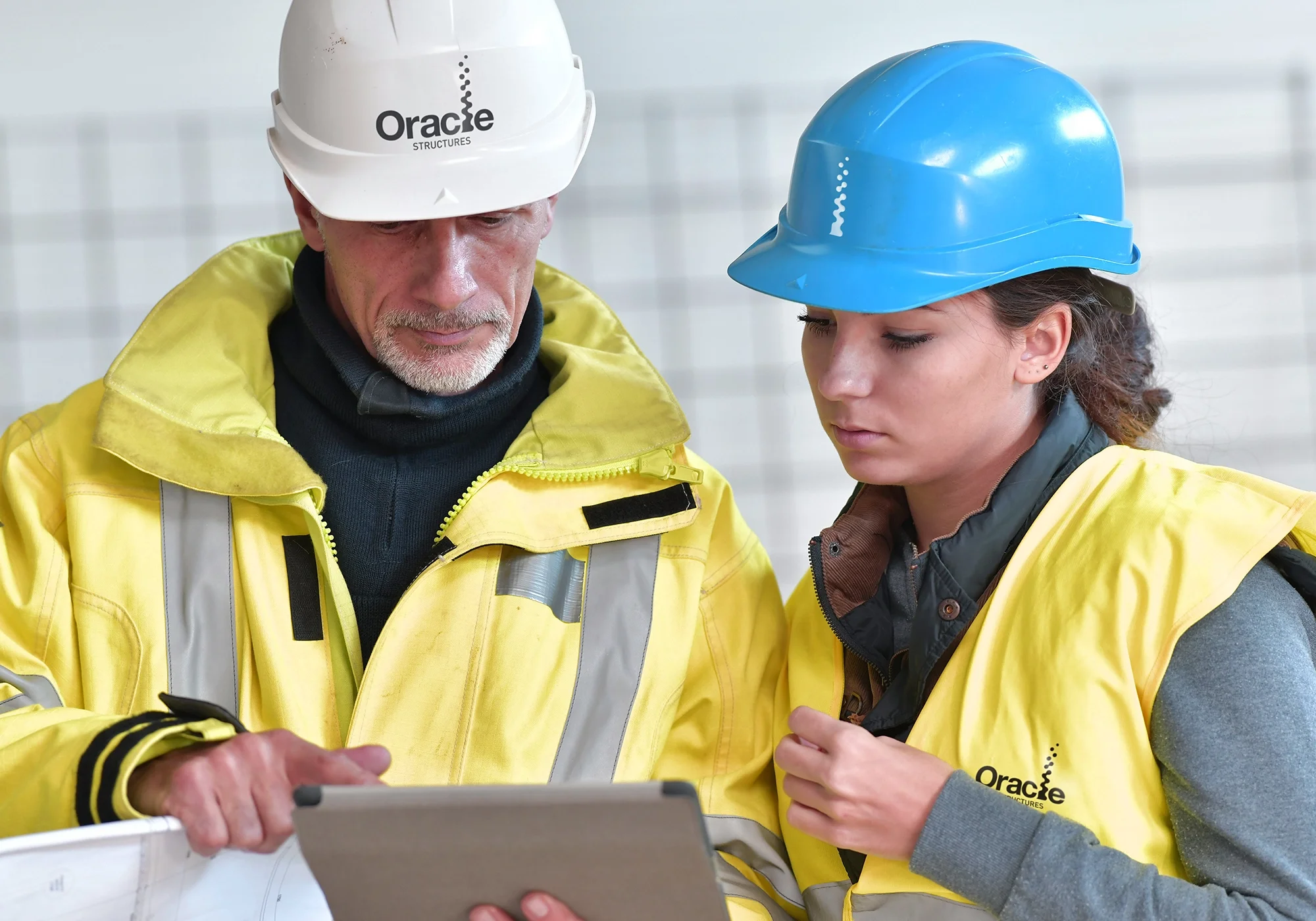
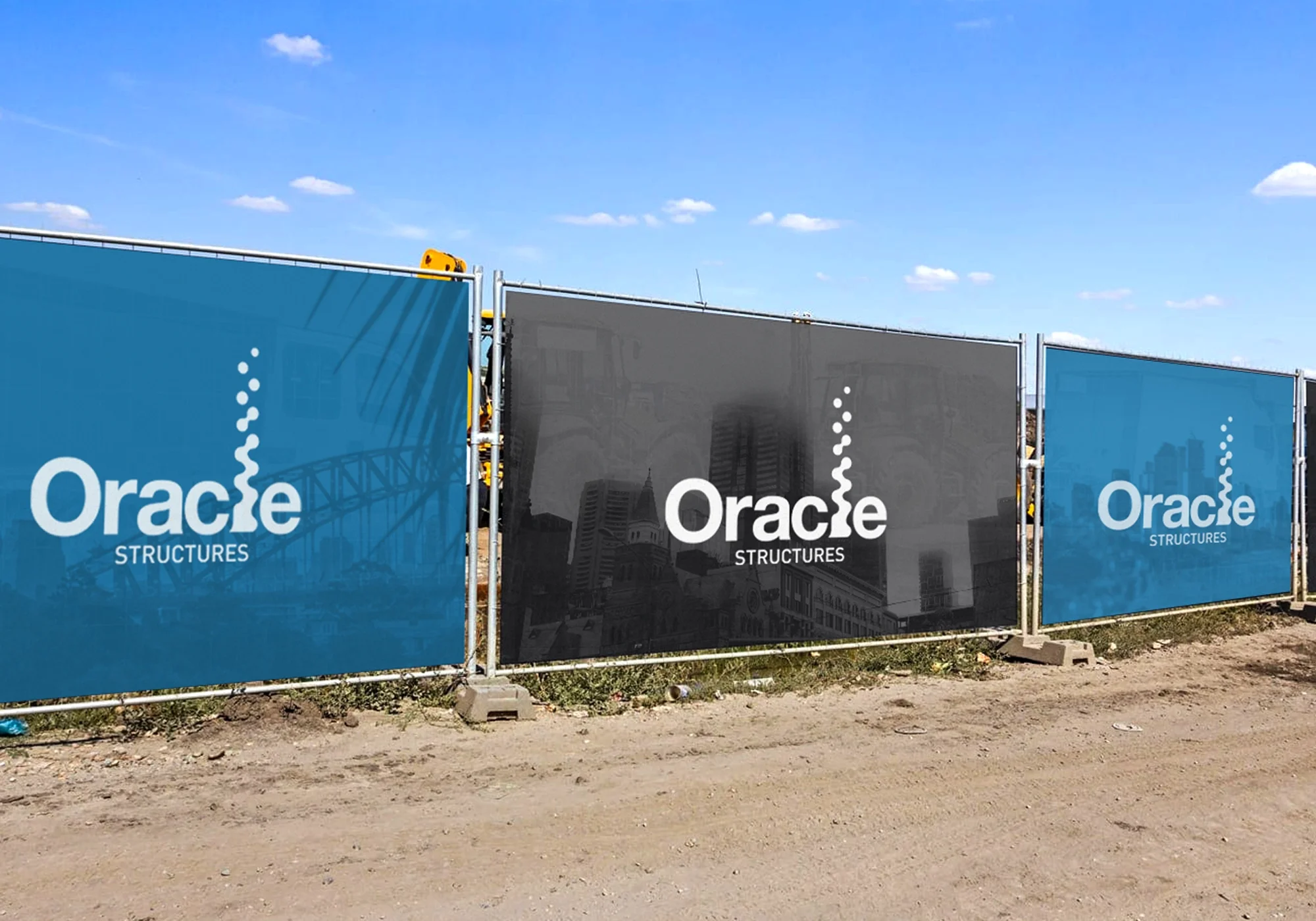
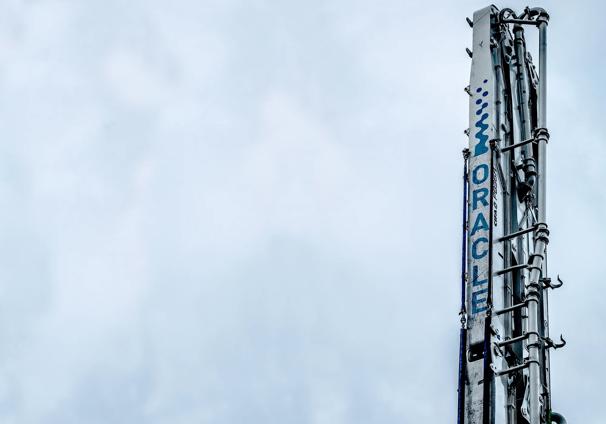
The Oracle Structures identity was designed to express strength, precision and continual progress through a distinctive visual language inspired by the construction process itself. The custom logomark transforms the letterform into an abstract structural column, using a fluid vertical form that evolves into a series of ascending elements to symbolise concrete being poured, structural growth and the progression of a project from foundation to completion.
This sense of upward movement reflects the company’s role in shaping Australia’s skyline while reinforcing its commitment to quality, reliability and technical expertise. Paired with a bold contemporary wordmark and a confident colour palette, the identity creates a memorable, highly adaptable brand system that performs consistently across construction sites, heavy machinery, PPE, vehicles, documentation and digital platforms, positioning Oracle Structures as a trusted partner in complex construction delivery.